JTL Archives
Journey Through Landscape began early in 2018 to explore the concept of ‘Landscape’ using thread painting, thread sketching, and free machine embroidery.
The first 12 articles were originally published on DeborahWirsu.com and are reproduced here.
Click on any link to go to a particular article.
- JTL No 1 — Bridge in Taichung
- JTL No 2 — Tuscan Landscape
- JTL #3 — Colosseum Sunset
- JTL #4 — Emerging from the rainforest
- JTL #5 — To the Sabine Hills …
- JTL #6 — Xuanwu Lake
- JTL #7 — Evening stroll in the square
- JTL #8 — By the River Seine
- JTL #9 — Mediterranean Views
- JTL #10 — Nature’s Showtime
- JTL #11 — The Path Less Travelled
- JTL #12 — Hometown
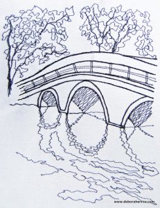
JTL No 1 – Bridge in Taichung
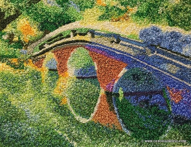
Thread painting using tiny, free motion machine zigzag stitch features a lovely bridge in Taiwan, interpreted in Impressionist style.
Measuring just 5″ x 4″, it is worked with 40 gauge rayon thread on a heavy cotton, stabilised base.
The picture is stitched using my ‘Carpet Stitch’ technique – a tiny free motion zigzag stitch. This creates an effect a little like carpet or tapestry.
Those of you who remember my work from a few years back may recognise this bridge, as it’s not the first time I’ve used it as inspiration.
Here is my initial outline thread sketch—created for Thread Sketching in Action No 12. As you can see, the bridge is the same, but the orientation is portrait rather than landscape, which gives the picture a very different appearance, as does the stitching style.
This article was first published on 8 February 2018 on DeborahWirsu.com
JTL No 2 – Tuscan Landscape

The journey continues this week with another thread painting that is a complete change of style from Journey Through Landscape # 1 – Bridge in Taichung, although there are some similarities.
- Style?… No, definitely not!
- Stitch technique?… Yes! (more on this below)
This landscape is another small picture, measuring 5″ x 3″ (12.5 cm x 8 cm), approximately.
Like the previous picture, this is worked with 40 gauge rayon embroidery thread on a stabilised, heavy cotton base.
Style
Breaking away from the Impressionist view of a landscape used last week, in this piece the focus is on simplifying.
By creating a naïve design, there is the opportunity to break the elements of the landscape down to their core shapes.
There is also the opportunity to explore the use of solid blocks of colour.
I remember working a commercial tapestry kit (many years ago) that depicted a busy, village scene designed using a naïve, cottage style. Although I’ve never been particularly drawn (in the past) to ‘folk’ art, I find myself increasingly interested in the bold designs and how this look can be recreated with thread painting.
Stitch Technique

Like Journey Through Landscape #1(and many of my other works—some of which are featured in the Thread Sketching in Action series), this is stitched using my Free Motion ‘Carpet Stitch’ technique.
When I initially explored working this way, I was attracted by the similarities of the finished look with that of tapestry. But of course, real tapestry has much more even rows and stitches (or weaving) and it finally dawned on me that my stitching is much more akin to some types of broadloom carpet!

Working in Free Motion Carpet Stitch can be slow … very slow … which is one of the reasons why I tend to employ it for smaller projects.
However, there are variations to this stitch that are a little faster to work—and therefore better suited to larger works—I’ll bring these into the conversation another week!
This article was first published on 15 February 2018 on DeborahWirsu.com
JTL No 3 – Colosseum Sunset
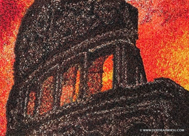
The year is AD80. Titus, Emperor of Rome, opens the Colosseum.
Let the games begin!
Spectators file in through four grand entrances, taking their places on the tiered seats surrounding the arena, packed in as tight as they can fit. They want to be‘entertained’.

But‘games’in the Colosseum were ugly and brutal.
The floor of the arena was sometimes dyed red to disguise the spilled blood. Trap doors in the floor opened to let wild animals leap up from below to gnash and kill their victims.
These were murderous games, indeed.
A marvel of ‘modern’ construction
In Ancient Rome, this building was a triumph of construction—built for a dubious purpose.
Today, we can visit this magnificent building—or what remains—and only marvel at its size and the intricacy of the architecture.
Setting the scene for a landscape thread painting …
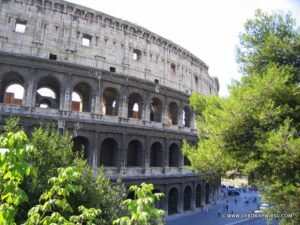
Rome in the summer-time is a joy for many these days, and watching the sun set behind the Colosseum creates a stunning spectacle.
Having set the scene for my thread painting—Journey Through Landscape #3 – Colosseum Sunset—I tried to remember, from my visit to Rome, the intensity of the Italian sun in summer, the size and grandeur of the now-crumbling Colosseum.
Stitching
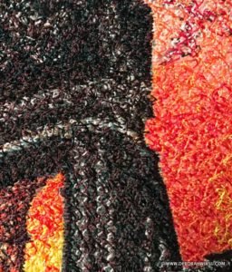
Using free motion zigzag stitch, my aim was to suggest the rough texture of the stone, the size of the building and the heat.
The bright light behind the building sets the stone almost into silhouette, creating a challenge when building up the texture.
But working this as a silhouette in black thread would, in my opinion, have been less effective than adding lighter coloured threads—even white—to the mix of brown, grey and red colours that make up this thread painting.
This picture measures a little under 7″ x 5″. Layers of free motion zigzag stitch, in multiple colours, completely cover the underlying fabric.
This article was first published on 22 February 2018 on DeborahWirsu.com
JTL No 4 – Emerging from the Rainforest
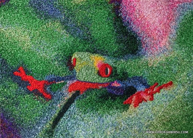
OK, OK, I admit that this may be stretching the concept of ‘landscape’ rather thin, but I just couldn’t resist using this idea to create another piece for the Journey Through Landscape series.
After all, Red-eyed Tree Frogs do live in tropical rainforests, and rainforests are landscapes!
See, I can talk myself into anything if I try!
Red-Eyed Tree Frog FAQ
- With a scientific name like Agalychnis callidryas I’m glad these little guys have a ‘common’ name, too!
- The name means Beautiful Tree Nymph, due to their froggy good looks!
- They use their red eyes and orange feet to scare off predators.
- Diet consists mainly of insects—moths, cockroaches, flies, etc.
- They shoot out their sticky tongue to catch their prey, and then swallow it whole!
- These guys are pretty small—between 1″ and 2.5″.
I was going to do a thread painting of the Australian Green Tree Frog, but with a common name like the Dumpy Tree Frog(because they tend to get overweight and therefore can’t jump well), I’m afraid Beautiful Tree Nymph won my heart today!
Much more handsome! …sorry, Dumpy!
Capturing the action …
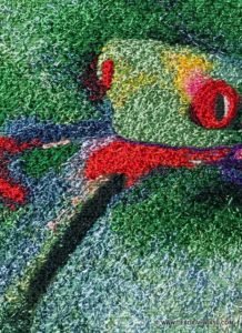
With his feet firmly planted on nearby leaves (you know—those huge, tropical dinner-plate-sized leaves), some poor, unsuspecting moth, fly, or other insect is in his sights.
ZAP!
Out shoots that immensely long, red tongue.
GULP!
Down goes dinner! No chewing required!
Thread painting—Colour Fun!
After doing some digital and colouring work, the thread painting began.
Working on this piece was a joy, as one of my favourite pastimes is blending and shading with thread, which the background of this design gave me ‘in spades’. I lost count of how many different thread colours I used—greens, blues, pinks, oranges, reds, white and tones, mauves and purples.
It is a feast of colour fun in one small thread painting!
Finished size: 5″ x 7″.
My focus at the moment is to fully develop this particular technique and style of thread painting, so I’m exploring all the possibilities.
My ‘Carpet stitch’ technique has been employed, but this time in a quite different design to previous projects.
Checking out the colour wheel, it’s easy to see the complementary use of green and red in this thread painting. The little touches of blues and yellows add a triadic element to the picture, creating a perfect balance of colours.

Following on from last week’s discussion of leading the eye around the picture, this design has a prominent ‘line’ of red across the piece—feet, tongue, eyes.
However, the large patch of pink, and the tiny touches of the same colour on the frog’s legs, again cause the eye to move around—this time in a more triangular fashion.
Further to this, there are three small darker areas of purple shades (top left, bottom left, and just to the left of the pink area), which also serve to generate eye movement.
Odds and Evens
So this is a work in ‘threes’, or triangular concepts. Keep in mind, when you work, that uneven numbers generally work better than even numbers. Of course, there are exceptions, but then there are always exceptions to rules!
This article was first published on 27 February 2018 on DeborahWirsu.com
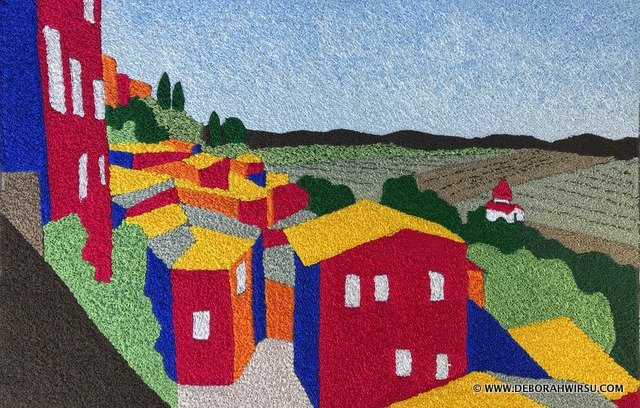
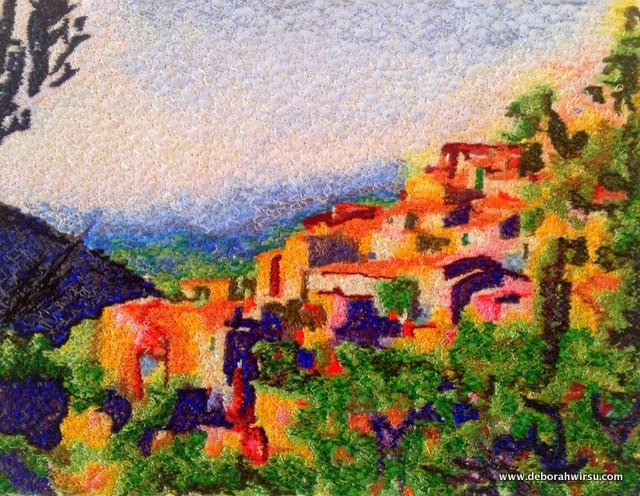
JTL No 5 – To the Sabine Hills
Sitting at my desk this morning, the parakeets and rosellas are chirruping away in the huge gum tree (eucalyptus) in my neighbour’s garden; the day is glorious—perfect autumnal weather!
But yesterday I unsettled myself, stitching memories of a fortified town in the Sabine Hills of Italy.
Ah! The Sabine Hills.
The very name sends a frisson of excitement through my veins!
What is it about exotic places, names, or simply words that can stir our souls, our ‘travel bug’, and see us eager to board the next international flight?
Flying into Rome ten years ago, I bypassed the sights there (temporarily) to go directly to the Sabine Hills. Rome airport has the convenience of also being a rail hub where you can jump onto the sleek, high-speed intercity trains—but alongside my platform was an older, non-airconditioned rattler that would be my ticket to the Sabine Hills.
I was hot and tired, and those pesky gypsies were lurking, awaiting opportunity from unsuspecting travelers.
Destination: Casperia
Casperia must be one of the best-kept-secrets in Italy!
Cobbled streets entice you up and down and around — always inviting a peek around a corner or a step down an alleyway. How do you know what thrill will greet you if you don’t take a look?

From the high, fortified walls that surround the old city of Casperia, and looking over the top of the ‘new’ Casperia, the vistas are glorious. It doesn’t seem to matter where you are—every direction brings on a new wave of exclamations!

Inspired to stitch …
Being easily excited by scenes like this, I was inspired to recreate my memories— or should I say, ‘reignite’?
It’s time I went back, but for now, my memories in stitch will have to suffice.

I turned to a different style for this thread painting. Much of my work falls into the ‘Impressionist’ category, which also would have worked well for this design.
This leans more toward a ‘folk’ design.
I wanted something bolder. Something that would reflect the heat, the colours of Italy, the houses that appear to tumble down the hillside, but have remained standing — some for a thousand years.
Simplify, modify, colour, stitch …
To create the block-style houses I simplified my drawing, paring it back to basics, before adding colour with high-density thread painting.

The major difference with my stitch technique here is that I have, in the main, not blended and shaded colours. Rather, colour has been applied in solid blocks.
This creates a striking and energising appearance.
Not for the first time …
Of course, this is not the first time I have featured Bella Casperia in my thread painting journey.
This piece — indeed titled Bella Casperia— featured in a short Travel Series I created a few years ago. It’s still one of my favourites!
Being one of my earlier explorations into combining thread painting and the Impressionist style, this work opened up a whole new field of interest for me.
The style has captured my attention and my heart—for now—and I can’t get enough of it!
... and I must return to Casperia soon …
This article was first published on 8 March 2018 on DeborahWirsu.com
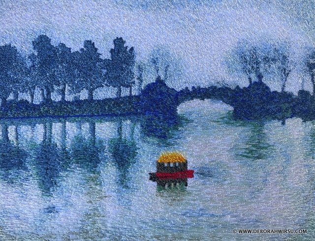
JTL No 6 – Xuanwu Lake
Colours of the landscape
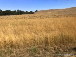
Last weekend I went on a road trip to the next state (a 5-hour++ drive) for another music concert, and along the way had plenty of time to gaze out the window at the surrounding landscape (no, I wasn’t driving!).
Although this part of the world is now well into autumn, the landscape still suffers the ravages of our hot summers. Everything is brown and dry. Trees, already a subdued eucalyptus green, are dusty and thirsty.
All around me, the colours reflected shades of yellow, ochre, brown, eucalyptus green, khaki, grey, ecru, and the occasional brighter green of some non-native vegetation.
As I’d already decided on an image and idea for this week’s Journey Through Landscape thread painting, the contrast of temperature between my thread painting and the surrounding countryside was stark.
The colours of this trip across the state were warm colours. ‘Dry’ colours, if there is such a thing!
Looking at the thread sketch of Xuanwu Lake, what colours can you see? Certainly not warm, dry colours!
These are predominantly shades of blue and white. Cold colours. A hint of dampness. A winter scene.
How does the warmth of colour affect us?
Colour can be associated with mood and emotion, or our perception of a scene, a place, a vista.
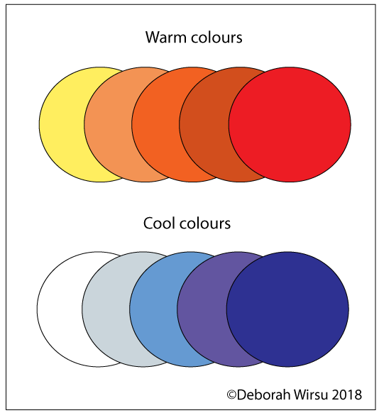
Warm colours (red, yellow, orange) are typically thought of as exciting, and can also evoke feelings of warmth or homeliness.
Cool colours (blue, green, violet), on the other hand, are calming, meditative and soothing, evoking stillness and quiet.
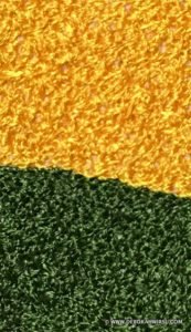
Here is an example of warm colours in a range of browns, and cool colours in greens…

Atmosphere
Atmosphere also plays a role in how we perceive the ‘temperature’ of a colour.
Go outside, particularly towards dawn or dusk, and you’ll notice that the colours at the horizon are generally lighter in shade and tone than colours ‘higher’ in the sky.
Look again at the charts of warm and cool colours above. What do you notice about the palest colours? Do they seem to be further away than the darker colours?
Of course, there are always exceptions, but as a general rule, as objects in a landscape become further away, they become lighter in value, and cooler in temperature.
This can easily be seen in my thread painting of Xuanwu Lake—the feature of this week’s Journey Through Landscape thread painting.

This thread painting is abundant with cool colours, giving the scene a calm and soothing appearance—there is nothing harsh or aggressive present. It represents the tranquillity of a still, cold, wintry day.
The tiny splash of warm colours—red and yellow—with the boat creates a delightful element of interest, which also draws the eye—a topic recently discussed in other Journey Through Landscape stitched pictures.
Reflections – a challenge of colour
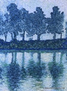
Stitching this thread painting posed some challenges—the limited colour palette, and the need to use many shades of thread; as well as working the reflections of the trees on the lake surface.
In order to achieve the (in my opinion!) quite satisfactory result that I did, there was a need to examine very carefully the range of thread colour used. Look at most reflections in water and you’ll find that the colours of the actual object (in this case, the trees) and the colours of their reflections are a little different, due to the play of light on object and water.
Stitching the reflections also entailed a change of stitch technique. The trees are, in the main, stitched using my ‘carpet stitch’ technique, while the lake surface, the water, is worked using more horizontal stitches, giving the ripple effect on the water’s surface.
As you can see from this picture, it’s possible to achieve great results with a very small colour palette, drawing on the many tones and shades that fall within that palette.
This article was first published on 15 March 2018 on DeborahWirsu.com
JTL No 7 – Evening Stroll in the Square

One technique—Two different looks
Continued fascination with this technique—free motion zigzag thread sketching—brings me back, time and time again, to explore the possibilities it offers.
My plan today is to further explore Colour Theory, but once I started writing this, I was also struck by another idea as well.
So it seems like a good thing to briefly cover them both!
I have used exactly the same technique as for last week’s thread painting, JTL #6 Xuanwu Lake, and yet this piece, Evening stroll in the square, presents a totally different look.
Why?
Different scene
Today’s subject differs vastly from Xuanwu Lake, being a cityscape, or to be more precise, a townscape, rather than a landscape.
This, in itself, forms a different impression in our mind when viewing the picture. Evening stroll is urban, with buildings and people. So immediately our subconscious thoughts establish in us a different mood.
Different eye movement
Xuanwu Lake is serene and calming. With the bright, contrasting focal point almost centre in the picture, your eyes are immediately drawn to that spot.
Then the soft colours and gentle surroundings invite you to explore further. Slowly and calmly.
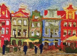
Evening stroll is more ‘energetic’, in that it forces the eye to move around the entire scene more quickly.
The colours and detail immediately generate a more active mood.
When your eyes first land on the picture, the bright red buildings that pillar the picture each side encourage your eyes to flit back and forth across the scene, gradually taking in the cooler coloured buildings that make up the centre of the picture.
Finally, you are invited to explore further, noticing the shapes of the people wandering the square, the yellow umbrellas, the cobbled stones …
Different colour set
Rather than presenting a monochromatic scene, Evening stroll in the square uses complementary colours, across both aspects of the colour wheel.
Red — Green.
Yellow — Blue.
Although a wide range of colours has been used in this thread painting, they are predominantly red, yellow, green and blue (plus variations).
There is actually a very large range of colours in this one, small thread painting which measures just 5.25″ x 3.75″!
It’s a tiny thread painting, in which 25 different colours of thread were used.
This apparently unruly mix actually works well, creating a cheerful and comfortable look.
Colours—Monochromatic, Analogous, Complementary, Triadic
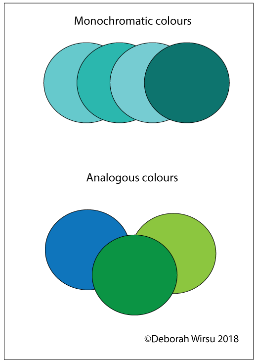
- Last week’s thread painting (Xuanwu Lake) used monochromatic colours. They are shades of one colour.
- Analogous colours sit next to each other on the colour wheel. They sit comfortably with each other, even if they are different colours.
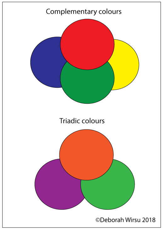
- Colours that sit opposite each other on the colour wheel, such as red and green, yellow and blue, are considered complementary colours. They contrast each other, yet are also still happy working together.
- Triadic colours also contrast each other, but instead of sitting opposite on the colour wheel, they form a triangular selection around the colour wheel.
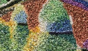
A close-up reveals …
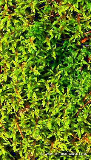
No this is not a close up of the thread painting! This picture is, in fact … moss!

The second is a close-up shot of the stitching in my thread painting.
I could not help but notice the similarity! As you can see, my stitching is far from regular.
Embrace the irregular!
Although this is probably of no significance whatsoever, I think it’s an interesting comparison that has, once again, sent my mind racing in different directions.
Sometimes the smallest observation stimulates creativity!
This article was first published on 22 March 2018 on DeborahWirsu.com
JTL No 8 – By the River Seine
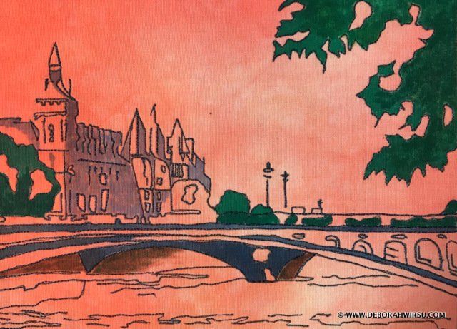
Transcending two themes
Is this a LANDSCAPEthread sketch or an URBANthread sketch?
It certainly transcends both these categories, yet one thing is definite—it is nota thread painting!
So I’m going to ‘sit on the fence’ and call it an URBAN LANDSCAPE thread sketch!
What is the difference between thread sketching and thread painting?
Thread sketching, thread painting and free machine embroidery all fall under the same umbrella, for the simple reason that they are all free motion stitching techniques. However, there are subtle differences.
Since the advent of modern, domestic sewing machines that can be set to‘free motion stitching’ textile artists and quilters have opened up to the world of exploring completely ‘freestyle’stitching.
‘Free Motion’ is now a term we are all now familiar with.
Of course, these days, nearly all sewing machines—from domestic to professional—are able to operate free motion, with some designed for this purpose alone.
Contemporary textile artists use free motion stitching to enhance their work in dozens of different ways. This is from where the terms Thread Sketching, Thread Painting and Free Machine Embroidery have derived.
- Thread Sketching: Drawing an outline, shape, design or picture with a sewing machine, usually with the feed dogs down.
- Thread Painting: Filling shapes with free machine stitching, shading with thread, or covering all the fabric with free motion stitch.
- Free Machine Embroidery: Encompasses both Thread Sketching and Thread Painting. It is usually less formal than programmed machine embroidery.
The bottom line, in my opinion, is that these terms are largely interchangeable, with the common ‘thread’ being that they are worked ‘free motion’, usually with the feed dogs lowered on the machine. The stitcher is in control of the design, rather than the design being pre-programmed and stitched using a computerised sewing machine.
Urban Landscape thread sketch—keeping it simple!

The premise behind this thread sketch is simplicity.
Take a photo
Starting with a photo I took in Paris a few years ago, the first decision was whether to work a thread sketch or a thread painting.
Given that I’ve done several thread paintings recently, it seemed a nice idea to blend this project with my interest in Urban thread sketching as well.
Create a design
By paring the photo back to its main shapes and features, I drew a pencil sketch to use as a guide for the stitching.
Decide on a background
The second decision regarded the background. Many options presented. The background fabric could be plain white, beige, mottled or even collaged or patterned (if chosen with care!). However, I wanted to keep the concept simple while also giving it a bit of a colour kick, so I chose this rather unexpected, apricot-coloured, hand-dyed fabric.
Stitch
Now to the stitching. Simple, free motion stitching—drawing with the sewing machine—makes up all of the stitched components of the picture. In some places, the lines were worked over twice to give them a bit more definition.
But with the stitching complete, there was still something missing.
Add colour
Of course, the picture needed some touches of colour to really make it ‘pop’. Yes, it worked as a simple thread sketching, but by colouring just a few key areas in the picture, the scene suddenly came alive!
Done!
So out came the fabric paints and in just a few minutes the picture was complete!
This article was first published on 29 March 2018 on DeborahWirsu.com
JTL No 9 – Mediterranean Views

Landscape plus coast plus a touch of ‘urban’
So, I’m wondering should I call this ‘landscape’, or ‘urban’, or coastal? It’s really a combination of the three!
This particular church is featured often in tourist brochures and personal travel snapshots, so it’s probably well-known to many of you.
Exploring shading and tone
The limited colour palette and large areas devoid of many features made this a perfect project to use to explore blending and shading threads to build up the depth of colour.
This is something I just love doing! Do you? If you haven’t tried it, give it a go!
It doesn’t matter what stage you’ve reached in your thread painting ‘journey’ — anyone can try this. Remember! You don’t need to create something ‘neat’. Embrace the irregular!
It’s possible to start simple, blending and shading just a few colours, before moving on to something as complex as this one, which includes dozens of thread shades!
Using glossy rayon thread to work the ocean surface and distant shore, combined with tiny, dense free motion zigzag stitch meant that I could not only create the texture of the ‘waves’, to suggest movement on the water surface but also to indicate direction of light source and glow of the sun reflecting on the water.
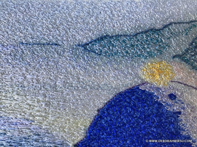
The biggest challenge
The biggest challenge surprised me. Thinking the church walls would be ‘easy’ because they are predominantly white, I launched into the stitching with just a few shades of thread. However, as work progressed, it became obvious that there are many — MANY — shades and tones in these walls.
And given that this entire picture is about 8″x6″, that made for some frequent changes of thread colour!
This reminded me of something I had temporarily forgotten — really consider the fine detail. Especially when it comes to colours.
Look very closely at your reference image!

Rarely is anything just one colour, and in art, it’s necessary to use a range of colours to make something look like just one colour!
The opposite of what we may think.
Think about a solid colour — any colour. Solid colours are quite flat.
They are used to great effect in much contemporary art, graphics, abstract art, and comics.
But if you want something to look ‘realistic’, then it’s necessary to shade and tone with colours.
Compare and Contrast
Explore the use of colour in these three recent Journey Through Landscape thread paintings.


Each uses the same stitch technique, but the first one uses blocks of solid colour with no blending (other than in the distance, which is not visible in this image).
The second incorporates detailed shading using blues and greens only.
The third, this week’s offering, uses blues and whites for the roof and many shades of white, yellow, brown, black and grey in the walls — all in an attempt to make the walls look ‘white’, while also giving them shape.
Do these strategies work?
In these instances, I think they do — but I certainly don’t always get it right!
Try out both these colour techniques …
Next time you’re doing a thread painting, try comparing two different ways of working:
- Blocks of solid colours
- Shade and tone with many threads
This article was first published on 21 April 2018 on DeborahWirsu.com
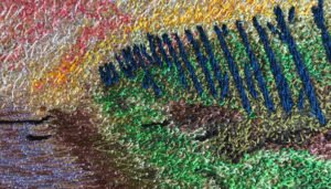
JTL No 10 – Nature’s Showtime

When thread painting and thread sketching, something I love to do is use my favourite photos as inspiration, and if I really love them then I’ll often use them several times to create different interpretations.
Photo to first interpretation
Three years ago — January 2015 — I was in the Australian ‘High Country’of Victoria, at a week-long chamber music workshop. Every evening the 40 or so musicians — talented amateurs and professionals — would gather in the communal living area of one of the ski lodges at the top of Mt Buller.
Often the evening sky turns on spectacular sky shows that are awe-inspiring and curiously calming, as though, for once, all is good in the world. (Oh, how I wish that were so!). These sunsets fade to crystal-clear evenings where we then witness the amazing galactic vastness of the Milky Way.
Being summer time there was, of course, no snow. Only spectacular and gorgeous views over the tops of the surrounding hills and bushland. I say ‘hills’ here, rather than ‘mountains’ as anyone familiar with the mountain ranges of New Zealand, Europe and the Americas would possibly be amused about us calling many of the landforms here in Australia ‘mountains’.
I guess it’s all relative, so ‘mountains’ they are — to us!
(Australians have a sense of humour!)
First thread painting
Some weeks later, I transformed one of my photos into a new micro-quilt thread painting. It’s just 10” x 4” and finished as a quilt, with black fabric binding.
A regular quilt sandwich, including low-loft batting, forms the base, with a digitally printed image of the top, over which I then worked the thread painting.
This was predominantly achieved using free motion straight stitch worked in long, horizontal sweeps across the image, gradually blending the colours to build up the desired impression.
Three years later … V2
Anyone who has known me for a while will know that there are two things I’m drawn back to time after time:
- The painterly Impressionist style
- The endless possibilities of free motion zigzag stitch
So for this second version, I decided to take this more ‘painterly’ view of the scene, employing free motion zigzag stitch to create the image.
Comparisons …
By comparing the two thread paintings you can see that the first is ‘photographic’ in its interpretation, while the second is ‘Impressionistic’, less distinct, with blurred details and edges.
I’m not sure how clearly you’ll be able to see this in the photos, but you may notice that a mix of both very large free motion zigzags and tiny zigzags have been employed.
Each has its place in the creation of the scene.

This thread painting is a little larger than the first, being about 10” x 8”.
This article was first published on 28 May 2018 on DeborahWirsu.com
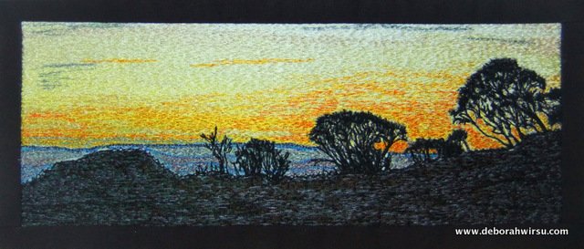
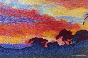
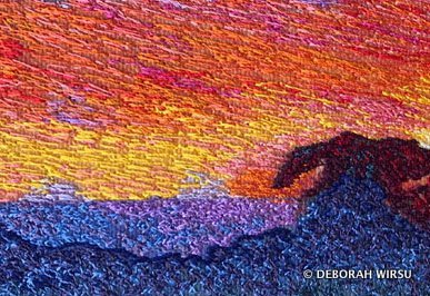
JTL No 11 – The Path Less Travelled
Well, I finally got back to the sewing machine to continue my Journey Through Landscape, using thread sketching and thread painting techniques.
This thread painting, perhaps more ‘subdued’ than some of my others, is a reflective piece in which I’ve tried to evoke feeling and mood.
The mood of wild and remote places, of space and quiet and vast, empty skies.
The more you look at this apparent ‘nothingness’, the more you see.
The name—The path less travelled …
Anyone—anywhere—who has ever studied English poetry or literature will be familiar with Robert Frost‘s well-known and much-studied poem The Road Not Taken.
Two roads diverged in a yellow wood,And sorry I could not travel bothAnd be one traveler, long I stoodAnd looked down one as far as I couldTo where it bent in the undergrowth;Then took the other, as just as fair,And having perhaps the better claim,Because it was grassy and wanted wear;Though as for that the passing thereHad worn them really about the same …
My Path Less Travelled …
The stitching
Best view
This type of thread painting (as with much of my work), is best viewed from a distance.
For those interested in the technique, close inspection is useful, but you really do lose the overall feel of the piece if you stand too close!
Thanks for visiting!
This article was first published on 26 July 2018 on DeborahWirsu.com
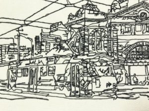
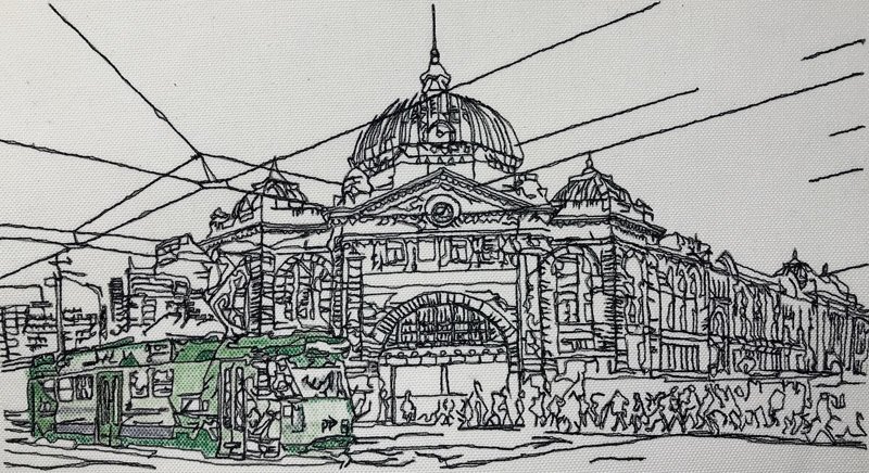
JTL No 12 – Hometown
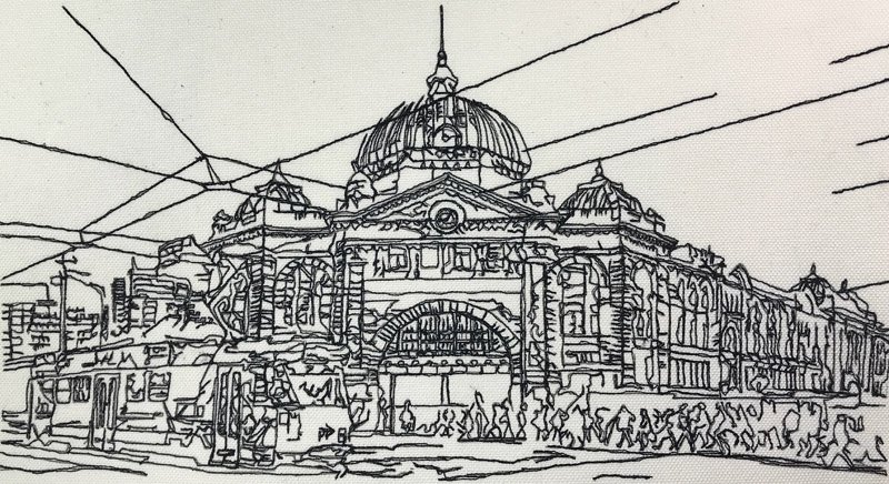
This piece serves a dual purpose — as another Thread Sketching inAction demonstration—No 90in the video series—andJourney Through Landscape No 12— for this is, indeed, an urban landscape.
Two for one! (or should it be one for two??)
This little thread sketch (it’s the size of a piece of standard printer paper) nearly didn’t get off the ground, due to a number of irritating problems encountered along the way.
Check out the TSIA video to watch this work in action!
No 90 – Hometown
Urban landscape and thread sketch in one
Featuring a well-known landmark building in my hometown, this thread sketch began life as a pencil sketch. One that proved to be quite challenging as I had unwittingly made the drawing rather complex! As it turned out, the pencil sketch preparation was the easy part.
The picture was stitched entirely with black thread, using free motion straight stitch.
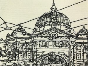
With its hundreds of tiny twists and turns, stitching back and forth, around, up, down, curved, straight … even then leaving out much of the fine detail of this lovely old building …
Yes, this work nearly defeated me!!!
And yes, I have bad days, too, when things go horribly wrong. It took me a while to figure out why these issues were occurring.
The thousands of people scurrying across the road and pouring into the station posed something a problem. I wanted them to look like people, but with, essentially, no detail.
I’m fairly happy with this part, even though the crowd was a huge ‘fiddle’ to stitch!

It all worked out in the end, I guess, as I’m quite pleased with the final result.
This thread sketch includes one of Melbourne’s much-loved trams, to which I have added a touch of colour, right at the end.
… and now, if you’ll excuse me, I don’t want to see this work again for a while!
Thanks for visiting!
This article was first published on 13 July 2018 on DeborahWirsu.com